Pages

Thursday, December 19, 2013

My Minneapolis

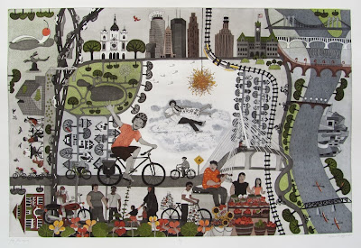
Well, here it is! I finally managed to get a print I am satisfied with a few days ago. I knew it would be a lot of work to print those two big plates, but I didn't expect it to be THAT much work.


My Minneapolis. 
Double-Plate Colour Etching, Relief Roll through Stencils.
60cm x 90cm. 2013. 

My Minneapolis is about my life for the past two years in this city. It is an (extended) view through my window past the Nasturtium in my flower box with the Minneapolis skyline on the horizon (see tiny figure at the window in the bottom left corner). The piece includes parts of the city that I know and like: the Walker Art Museum with sculpture garden, Loring Park, St. Mary's Basilica, the Stone Arch Bridge and St. Anthony Falls, the Weisman Museum, the Sabo Bridge, the Midtown Farmers Market, French Meadows Café with the greedy sparrows ready to pick up crums (from your plate if need be) and of course, the Greenway. This is also the city where I fell in love with my husband ten years ago on a school of art field trip. I think I mentioned this before, but one of the memories I had from that trip was the Chihuly sunburst chandelier, hence the center part. That's it for now. I'm taking a little holiday break now and in January I hope to start printing the edition. Cheers!

Monday, December 16, 2013

Editing the Plates - Progress Report Six of My Minneapolis

I spent the past week editing and proofing and editing and proofing my plates some more. Here are some of the changes and improvements I made. I didn't like how the yellow stencil looked on the chandelier (left), so I etched some shadows into the sunburst (middle) and together they work quite well (right). The sunburst looks a lot more dimensional now.


For the Walker Art Museum I tried to re-create the uneven surfaces of the metal tiles that cover the building. I used a small burnisher to burnish a pattern into to the aquatints.


The Weisman Museum also received some burnished highlights which give it more life.


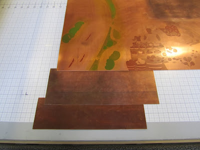
I also cut the stencils (top below) for the yellow and some red and green in areas where those colours would otherwise overlap, which makes it impossible to wipe à la poupée on the same plate. Through the stencil I simply roll the ink onto the surface of the wiped plate (bottom below). Well, three months later I finally have one good print, which I will try to post tomorrow, so you can finally see what the finished piece looks like. The editioning of the piece I will leave till the new year.


Sunday, December 8, 2013

Soap Ground Detail - Progress Report Five of My Minneapolis

This past week was quite busy with preparations for the Winter Cooperative Exhibition Prints on Ice at Highpoint. But I've inched my way a bit closer to finishing the My Minneapolis print. I worked some more on correcting and adjusting some small things and I think I worked out a solution for the white space in the center of the piece. A few months ago I took a weekend workshop in soap ground etching, which I've been wanting to try out in my work. The soap ground is a mixture of finely grated ivory soap dissolved in water and linseed oil to create a paste. This paste is painted in various dilutions and thicknesses onto the copper and works as a permeable resist to the acid. (The soap ground is the white stuff on the plate; the black figures are stopped out with asphaltum so the acid can't get to them). 


Where the ground is really thin, the acid will get through to the copper quicker than in areas where the gound is painted on thickly. The result is a wonderful painterly effect. This is my first proof of the result of the soap ground. 


I softened the edges around the soap ground a bit, but I still have to see if this part of the image fits with the rest of the print. I wanted to give the figure some sky or cloud backdrop so they're not simply floating in empty space under the Dale Chihuly chandelier sun (Sunburst). The figures that are white in this proof will later be printed with the key plate. Anyways, a few more days of editing and proofing. I hope by the end of this week I can make the first few prints of the edition. Keep your fingers crossed.

Tuesday, November 26, 2013

Registration of Multiple Plates

I learned this wonderful registration technique for printing multiple plates at Highpoint and I will be forever grateful. It increased the rate of successfully registered prints considerably. I'm not sure which clever mind invented this registration jig, but I believe my sources got it from Crown Point Press, so I'll refer you to their blog on how to make a registration jig. (I wasn't successful cutting my jig on the jump cutter, so I got someone to cut it for me with a diamond blade. It was quite jagged afterwards, but easy to smooth with a file). The jig consists of two L-shaped copper pieces. The narrower one, or registration bar, is taped onto the press bed with double-sided tape.


The second one, which should be at least as wide as your paper border, is a removable jig.


Every time I put my plate on the press bed, I place it into the jig, which ensures all plates are always in exactly the same spot. I keep the paper trapped under the roller when I change the plates, i.e. the paper never moves and the plates are always in place. This system is pretty much fool proof!

Proofing the Plates - Progress Report Four of My Minneapolis

I finished etching my plates and I've had to wait a while to get my turn at the big press. The studio has been busy lately and with my two plates taking up so much space, I wanted to wait till I had a quiet day so as not to be in anyone's way. To know how the etching has turned out, I need to pull a test print, or proof. I proofed both plates together last Friday. Unfortunately the print didn't come out very nicely for various reasons (I should know by now that I must proof on the editioning paper, but I had a sheet from the same brand only with slightly more surface texture that I wanted to use up...frugal me also used inks I had saved from printing before...anyways, the ink wasn't good and the paper didn't take the ink well, so the image came out rather washed out, streaky and blotchy).


The one good things I was able to discern on this proof was the registration of the two plates: it's working fine! I was afraid some stretching of such a large sheet of paper might become an issue. The colours need some adjusting, but they also might change if the keyplate prints better. I wasn't sure if some of the flaws in my print were errors in the aquatints, but a second proofing of the key plate with straight black ink on Monday showed me - to my huge relief - the plate is fine. While too dark and contrasty at this point, I can now burnish and edit my plate as well as adjust the ink's density by adding transparent base. With the grey and black printing properly now, the green won't come through as brightly on the next proof. 


If you're not familiar with Intaglio printing or etching, I'll briefly describe the inking of the plates here. With a small rubber squeegee, I spread the printmaking ink over the whole surface of the etched and cleaned plate taking care to fill all the little etched lines and grooves. I carefully scrape off most of the excess ink. 


Then I carefully wipe the surface with a bunched up piece of tarlatan (cheese cloth) to remove any ink from the surface without taking the ink out of the etched grooves. I will talk more about the colour printing with the stencil a different time.


Tuesday, November 12, 2013

Stage-biting Aquatints - Progress Report Three on My Minneapolis


For the past three weeks I've been working on the aquatints on my two plates. Aquatints are all the solid colour and tonal areas in an intaglio print. To prepare the plate for an aquatint, I have to degrease it really well. Next, I have to drop rosin onto the plate, which I do in a large rosin box, which is a wooden box with a fan at the bottom and a few tablespoons of rosin powder inside. After turning on the fan briefly, the rosin is suspended inside the box; I place my plate inside and let the dust settle for a certain amount of time (approximately five minutes). When I take the plate out again, I have an even, thin layer of dust of on the surface. The copper plate then goes on a hotplate where the rosin melts onto the surface. Wherever one of the rosin-dust grains melts to the plate, it will resist the acid. The acid, therefore, will bite between all the microscopically small dust grains creating a fine dot pattern or small pits that will later hold the ink. This is where the stage-biting starts, meaning I etch the plate in intervals while stopping out parts that are etched long enough. Once the plate has the rosin on the surface, for example, I stop out (paint with asphaltum) all the areas I want to remain white or don't want to hold any tone (see image above). Then I etch the plate for the first stage at 15 seconds for a really light grey, take it out of the acid, rinse it off, stop out all the areas I want to keep at the lightest grey. 


Then I etch the next stage, doubling the time for my next tone and I repeat this process until I have etched about seven stages, which will give me a nice range of tones from very light to medium tone to a rich black or a deep colour (so, I etch 15 sec, 30sec, 1min., 2min., 4min., 8min., 16min.). Below is a detail after the 1 minute etch. I do this whole process on both plates, etching different areas on each plate which will hopefully work well together once they overlap.


Working on two plates makes it a bit tricky to think about where the colours will go and where colours will overlap with greys to create different tones. I've made a colour map by painting water colours onto my line-etch. While it's pretty ugly at this stage and the colours aren't quite true to the etching inks, this map does help me to visualize the colours and tones as I work my way through the different stage-bites. I'm planning on wiping two colours à la poupée on the key plate and two or three colours on my second plate, possibly adding a stencil roll as well, that's why you see so many colours in my sketch. This might change later as I edit the plate. I'm also planning on doing some soap ground or spit bite in the blank area in the center. 
Friday, November 8, 2013

Needling, Etching, Proofing - Progress Report Two of My Minneapolis

Once the drawing is done, I prepare the copper plates for a transfer. To polish the plates, this time I borrowed a fellow printmaker's orbital sander which he had outfitted with an old piece of printing felt instead of sandpaper to which I applied jewellers' rouge and oil for a final polish. It worked like a charm and saved a ton of time on those two large plates (I need to get one of my own!!!). After the polishing, a hard ground (asphaltum) is evenly and thinly brushed onto the surface of the plate. This brownish-black and shiny coating will protect the copper in the acid. Transferring the pencil drawing is really easy at this point. Once the asphaltum is dry, I simply run the plate with the drawing through the printing press and the graphite transfers beautifully onto the black surface without smudging. In late September I started needling the plate, meaning that I draw the whole image with a steel needle (I also like to use my burnisher for thicker, bolder lines) through the asphaltum layer. Where the copper is exposed, the acid will bite and therefore create my line etch. In this close-up of my plate you can see part of the graphite transfer and part of the already needled lines.


Once the plate is etched, I strip the asphaltum from the surface. Left are all the etched lines in the plate, which I then fill with a special printing ink, polish the surface of the plate clean and run it through the press with a sheet of damp paper overtop. Voilá! I have the first proof of my line etch (click on image to enlarge).


Since My Minneapolis will be a colour print, I need a second plate which will hold the colour. My first plate, the key plate, will hold all the black lines and any grey-black tones or aquatints (more about that later). For the colour plate to line up with my key plate, I need to use a good registration system (more about that also later) that will ensure that both plates will always overlap properly and 'match up' correctly. For this to work, I transfer the key image onto my second plate. As soon as I pull the first proof, I exchange the just printed plate on the press bed with my second plate that is coated with the asphaltum. I then run the still damp paper with the fresh print through the press again on top of my second and blank plate. The wet ink offsets onto the plate and I can start needling the lines on plate two which will be my guides for where I want all my colour areas to go. The offset black ink is clearly visible on the asphaltum as you can see in the detail below. Now I have to draw (parts of) the image for a third time. Usually I etch the lines on the colour plate really lightly simply to be guides for the colour aquatints later. 

Thursday, November 7, 2013

Drawing - Progress Report One on My Minneapolis


Since my new piece is taking so long to finish, I've decided to share some of the early stages and the process that's involved in creating the etching plates with you. In early September I started working on a drawing for a print about Minneapolis. After two years of living here I have established some connections with the place that allow me to create a map of all the things and landmarks that are significant to me. I did a lot of biking around in late summer to take photographs of buildings, bridges, parks, as reference images. I started on the Greenway, which runs just a few blocks from our place (it's the most amazing double-laned bike highway running east to west through the city along old railroad tracks...hardly any lights or stop signs...you just go go go), across the Sabo bridge (cyclists' bridge alone!)  to the Mississippi river, up along the river to the St. Anthony Falls and the Stone Arch Bridge, through downtown and back. With all the things I wanted to include in the piece, it got rather large, but since I've always wanted to try to work at this scale, I decided to go for it, especially since I have access to a large rosin box and acid bath here at Highpoint. The plates are 24" x 36" (60cm x 90cm)...yes, you read correctly, 'plates': this will be a double plate print. I hope it's going to work the way I imagine it. I struggled a lot with the layout of the image and since the scale and the placement of various elements kept changing, I opted for cut out sketches that I was able to move around, scan, enlarge or reduce in size until I was happy with the overall image. To me this is the same process as editing a text. I have a first draft; then I start to edit and shift things around until things look and feel right. The process is far from over before I can show a final piece of art.

Thursday, October 31, 2013

My First Lithograph

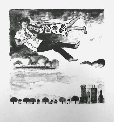
I have neglected my blog for a while, but I'm back again. I am currently taking a workshop in lithography at the Highpoint Center for Printmaking and yesterday I pulled my first prints. How exhilarating to have gone through that series of rather obscure chemical processes involving stone, grease pencils, tusche, gum arabic, and acids and in the end pulling a print from the surface of a stone! I wasn't sure I was going to like lithography because I feel I have so much less control over the image than I do in etching, but I actually really enjoy the process.


Homage to Chagall - Over the Town.
Lithograph.
20cm x 20cm. 2013.

As the title indicates, the image is obviously inspired by Marc Chagall's painting and print Over the Town. I recently read a novel about Chagall by Barbara Krause, and I still have so many of the images floating around in my head (more floating!). I think there is no other artist who captures the wonderfulness and the magic of love quite like Chagall does and where else does love take us but into that space between heaven and earth. 
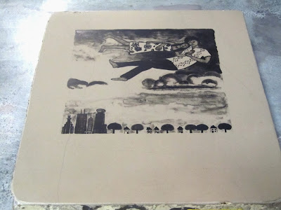
My image in the lithograph is taken from a detail of a much larger etching I'm currently working on (more about that very soon!) which is finally a piece about Minneapolis. Long story short, my husband and I met and fell in love in Minneapolis almost ten years ago, so of course I had to somehow fit that in with my Minneapolis print. I don't like working with new images when I learn a new technique, so I decided to translate this detail into tusche washes and crayon lines. Just for the fun of it, here's the stone with the drawing on it. 

Wednesday, September 4, 2013

Global Print 2013


A few months ago I was invited to send some work of mine for the Global Print 2013 Exhibition in Alijó, Portugal. I feel very honoured to have received this invitation and this is the first time I'm showing some work of mine in Europe. The exhibition runs from August 31 - October 30. One of my prints is currently on display there (McDermot Avenue I), and two others will be on display at the same location next year as part of the 7th Douro Biennal 2014. So, if you find yourself in Portugal, please check out the show.

Thursday, August 8, 2013

My Winnipeg IV


My Winnipeg IV.
Linocut.
60cm x 60cm. 2013.

My paper arrived and with great excitement I started printing and here is My Winnipeg IV. I'm printing on Revere, a newer line of cotton paper by the Cartiera Magnani mill in Italy, the same mill that makes the Pescia Magnani paper I usually use. As I mentioned in my previous post, I re-used a previous image of an etching for this piece (My Winnipeg II), changing the scale to 60cm x 60cm (24" x 24") and translating it into black and white, with a focus on patterning. It took me about a day and multiple prints before figuring out how to ink the plate just right. I always have to get to know a plate first after I've made it before I can print it properly, even though it's 'just' a relief print. It was the background that was (and still is) giving me a hard time to get it just right. The background consists of relatively wide open and flat areas I carved away, so in some places, the brayer inevitably touches down and leaves a mark, especially around the edges. I solved the problem by using a soft brayer with a thin coat of ink to get deep down into the recessed areas, which don't get the same amount of pressure as the surface of the plate resulting in that grey patterned tone. The looseness of the background takes away some of that black and white starkness of the image. The surface of the plate I ink up with a harder brayer. Now the printing of the edition begins.

Tuesday, July 30, 2013

Linocut - My Winnipeg IV


I was hoping to post a new print by now, but I'm still waiting on a delayed paper order, so no paper, no prints yet. Instead, I'll show you the plate I've been working on for the past few weeks. It's a fairly large linocut (24" x 24"). I've once again re-used a previous image I've done as an etching a few years back to re-interpret it in black and white on a larger scale. I have this wonderfully huge roll of flooring linoleum sitting around (6' x 8'), which I found really cheap at a thrift store a few months ago. Leftovers from construction I assume. I've been wanting to just cut a piece out and work on it for a while already and I finally did. I love this kind of linoleum. I used it at the university and at Martha Street Studio in Winnipeg, and having so much at my disposal suddenly made me salivate to do some block printing again, which I haven't done on this scale since the Steamroller Festival in 2010. The linoleum or the company that makes it is called Tarkett. It is a flooring vinyl with a high cork content and wonderful for carving. It is much softer than art linoleum or wood, but strong enough to hold up to large editions of more than 50 prints. Some people might want to mount it, but I never do. I just put a plexi-plate underneath to carry it around and slide it onto the press bed. The part I love best about this linoleum is that I can edit my plates. Imagine that, to edit a blockprint! I always edit my etchings, scraping, burnishing and re-etching, since a plate never turns out quite right the first time. With blockprints I tend to be very nervous getting only one try; if the tool slips or I've cut away too much in one area and the image looks off balance that's it, right? Wrong. I simply cut out the shape I want to replace and carve a new piece. You can see in the image below all the parts I replaced after proofing since I used leftover pieces of grey linoleum (the same kind and thickness as the orange...just a different colour). I simply use contact paper to adhere the pieces from the back and keep them in place. I don't know where the stuff is actually available, but perhaps a flooring company would know or even have offcuts.


Friday, June 21, 2013

Illustrations

 Single page
It has been so long since I posted some new work! For months now between trips and travels I've been working on and off to get my submissions for a new children's picture book ready and today I finally sent out the first ones. I finished a dummy book with sketches and I also made two finished illustrations as samples. I initially wanted to paint them, but that didn't work the way I wanted, so I foolishly opted for copper etchings. Can you imagine illustrating a whole book with double-plate etchings? But why not? I'm super happy how the illustrations turned out plus I had a ton of fun making them. I can't wait to make the rest of them. Well, I'm getting ahead of myself. First I have to land a publishing contract, which might take years.
If you can't figure it out from these two illustrations, the story is about an armadillo trying to find the rain since his waterhole is drying up. 
Double page


Tuesday, May 28, 2013

Exhibition at McNally Robinson

I have another exhibition opening next week. I will do a small artist talk at the prairie ink restaurant Monday, June 3rd at 7:30pm in Winnipeg. The exhibition will be on display until July 8th and continue with part of the work from August 6th - September 15th. 


Wednesday, April 24, 2013

Nivaclé Printmaking Workshop

I am currently in Paraguay and it is wonderful to be home again. I'm staying with my parents in the house where I grew up and I'm enjoying all the sun and lovely weather after coming from the still snowy Minneapolis. Aside from the exhibition I am having in Asunción next week (see post below) I will also teach a woodblock printing workshop to a group of approximately 10 indigenous artists for one week (May 12 - 18). Since I want to document the whole workshop more thoroughly, I decided to start a new blog for that. Please click here to be redirected for more information about the workshop and images of the artists' work.

Exhibition in Paraguay

Encounters and Farewells is my first exhibition in my home country Paraguay. After all these years that this country and my life there (before North America) have inspired me to make much of my work, I finally have the chance to show my work at the Manzana de la Rivera, a beautiful gallery complex in downtown Asunción that is part of the city's cultural center. The opening reception is Thursday, May 2 at 7:30pm in the Espacio Miguel Acevedo and runs till May 19th. I am thrilled to have this opportunity, which I have dreamed of for years. In so many ways I still feel deeply Paraguayan and yet I feel quite the stranger in the Paraguayan art scene. Perhaps I will have the chance to make some connections through my exhibition and stay in closer touch with what is going on in the art world in Paraguay. 


Wednesday, April 10, 2013

23rd Parkside National Small Print Show


I'm a little late with this post, but I've been distracted with my travel plans to Paraguay (Yeay!!!...more about that later). One of my prints (Leaving Behind) was accepted to the 23rd Parkside National Small Print Exhibition in Kenosha, Wisconsin. The juror was John Hitchcock who teaches at the University of Madison. If you want more information about the show, check out the press release here or go to the exhibition website
Since I moved to the US, I've come across so many opportunities to apply to exhibitions and network with other printmakers. I must say, to me it seems there is a much stronger and closer knit printmaking community all over the country here than I experienced in Canada. Perhaps I was just unaware of more connections and opportunities back in Winnipeg? Well, for now I enjoy making more prints and trying to show my work more widely and when I move back to Winnipeg some day I'll see what I can do about the networking in Canada.


Thursday, March 28, 2013

SGCI Conference 2013

I just came back from the Southern Graphics Council International Conference in Milwaukee, Wisconsin. While being very overwhelmed with the crowds, all the panels, demonstrations, and exhibitions, I enjoyed seeing so many printmakers from around the world in one place, making new connections, looking at wonderful prints, and thinking about why we do what we do. 
A highlight for me was to briefly meet Warrington Colescott, a Wisconsin printmaker who's work I've admired since my university days and who's colour etching techniques have inspired me in many ways. 

Friday, March 15, 2013

From Paraguay to Winnipeg Radio Interview

Yesterday Bennie Peters, my exhibition partner for our current two person exhibition talked about our work on the radio (I was still travelling from Minneapolis and just arriving in Manitoba, so I wasn't part of the interview). If you missed the live interview yesterday, you can still listen to it online for the next six weeks I believe. Here is the link to CKUW 95.9FM  'Eat your Arts and Vegetables'. Simply go to the archives and click on the March 14th interview. Thanks for doing this Bennie!

Monday, March 4, 2013

Exhibition at the Mennonite Heritage Gallery

I have an upcoming exhibition at the Mennonite Heritage Gallery, (Canadian Mennonite University campus) in Winnipeg from March 15th till April 27th. The opening reception is Friday, March 15th at 7:30pm. I am showing work together with an old friend of mine, Bennie Peters. Bennie and I both grew up in Paraguay and moved to Winnipeg to study fine arts, so our backgrounds are somewhat similar but our artworks are very different in style. It was hugely encouraging for me that Bennie was at the University of Manitoba already when I came. This is the first time we are showing our work together and I'm really excited about it!


Monday, February 25, 2013

Highpoint Impressions

After taking things a bit slower for the past few weeks, I just finished a small piece for an exchange portfolio. The print exchange is between 19 co-op members at the Highpoint Center for Printmaking, meaning we each get 19 different prints and it will be displayed at the Southern Graphics Council conference in Milwaukee/Wisconsin in March. I will attend the conference and I'm excited to see a bit more of the country, travel with friends, and of course, get inspired by meeting hundreds of other printmakers. 
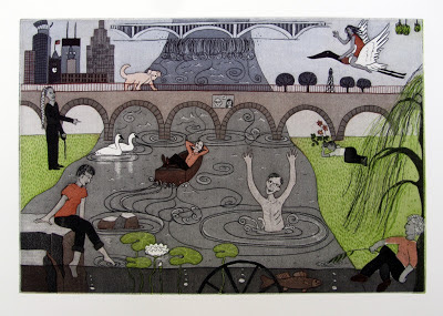
The Portfolio theme was Osmosis, with the underlying suggestion to think about how we as printmakers at the co-op influence each others' work. Each one of the figures in my print is part of the co-op and I borrowed image elements from everyone in the piece to compose the landscape. The main idea of the piece was inspired by J.'s prints of the Mississippi and the stonearch bridge in Minneapolis. Above are the St. Anthony falls. I added C.'s rocks and lilypads, B.'s willow tree, P.s trumpeter swans, E.'s flowering hepatica, and a few other details, so the whole piece is put together of other people's image elements, but still very much my own. Oh, and the two people on the plaque in the center of the piece are Cole and Carla, the founders and directors of Highpoint. Thanks guys! Highpoint is a wonderful place to be...as you can see in my print. 

Highpoint Impressions.
Double-Plate Colour Etching, á la poupèe wiping, 
relief roll through stencil. 
18.5cm x 30cm. 2013.

Sunday, February 17, 2013

Book Cover - What You Get at Home

I'm a little late with this, but I still want to share it. Winnipeg author Dora Dueck asked me last year if I would be willing to let her use one of my paintings as a book cover for her new book What You Get at Home (Turnstone Press). The book came out last fall and I am honoured that my work is on the front cover. What You Get at Home is a collection of short stories that are partly about a young woman who moved from Paraguay to Canada. While the character's story is quite different from my own, there  are instances where I find my own experiences of strangeness, of not fitting in, of the fear of trying new things, of misunderstandings, in the story.
Dora has a wonderful entry about the book cover in her own blog, which you can see here. The book cover is a painting I did in 2006; it currently hangs in our living room. In 2010 I took the same image and made it as an etching (which you see in the photo in Dora's blog). 


Tuesday, February 5, 2013

Postcards from America

I recently applied to grad school and prior to my application I had a meeting with one of the professors for a portfolio review. She recommended I add something completely different from the rest of my body of work to demonstrate that I am able to do other things besides autobiographical double-plate colour etchings. So, I decided to make work that is more about social commentary and satire that has a little more bite than the work I usually do. I made a small folio called Postcards from America with 5 postcards inside. The postcards are about my experiences (partly personal, partly based on newspaper articles, and partly fictional) I've had since moving to the USA. 
The image side of each postcard is a small 4" x 6" etching with chine-collé. The back side with text and stamps is screen printed. 


Crossing Borders


Only At Dick's


Black Friday Special


Illegal Alien Crossing Ahead


Pelican Massacre