Pages

Tuesday, November 30, 2010

New Manitoba Print Series


Manitoba I - Highway 75.

Etching, Chine-Collé, Hand Coloured.
29x49cm. 2010.

Manitoba II - Flax and Canola Fields.

Etching, Chine-Collé, Hand Coloured.
29x49cm. 2010.

Manitoba III - Pembina Hills and Hay Bales.

Etching, Chine-Collé, Hand Coloured.
29x49cm. 2010.

After my last city print I needed to get out into the country again for a little while. I've been meaning to work on this series for quite some time already, but I got stuck trying to figure out some non-toxic printmaking materials that ended up not working out and so I finally decided to go back to the tried and true methods and finally get started on the etchings.
The image with the little church I actually made as a large painting a few years back, but it's so huge that it doesn't fit anywhere and sits in a basement now. I wanted the picture to be a bit more accessible, because I really liked it and so I decided to make it as a print. I thought it would work well as a series that resembles a drive through Southern Manitoba since I always just see that church in passing on my way to somewhere else. The little church is one of my first memories of Manitoba when I came for a visit when I was 13. I fell in love with it the instant I saw it sitting so small and out of place between two highway lanes on the number 75 close to St. Agathe. It is the weirdest location for a church, but I'm happy it wasn't demolished during the highway construction.

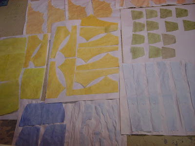
In these three prints I finally worked with Chine-Coll
é
again, a technique I enjoy a lot, but that I haven't used in three years. With Chine-Coll
é
I use dyed mulberry paper for the larger colour fields. The dyed paper that is cut to shape gets collaged into the print during the printing process. I place the dampened and pre-cut pieces of mulberry paper with a layer of sprinkled on wallpaper paste onto the copper plate (glue facing up) and once the damp printing paper is placed over the printing plate and run through the press, the mulberry paper gets stuck to the paper with the ink printed over top of it. To get just the right colours, I dye all my paper myself with fabric dye (see below).


Sunday, October 31, 2010

My first exhibition in Montreal

MAPPING MEMORIES: THE CARTOGRAPHIC ART OF MIRIAM RUDOLPH
November 6-27, 2010
at BLUE SUNSHINE
3660 St-Laurent, 3rd Flr.
www.blue-sunshine.com
Opening reception Saturday Nov. 6th, 5-7pm
Gallery Hours: Mon, Tues, Wed - 1pm-4pm

Miriam Rudolph is one of the most distinctive voices in the Winnipeg visual arts scene. Her stunning cartographic copper etchings make their Montreal debut on Saturday Nov. 6th at Blue Sunshine, with an opening reception from 5-7pm.

Thursday, September 23, 2010

My Winnipeg II


My Winnipeg II.
Copper Etching, Hand Coloured.
45.5cm x 45.5cm. 2010.

Finally, after a few weeks back at the studio I have a new print to show. As the title indicates, this print is similar to My Winnipeg from a few years back, but with more of a downtown focus of Winnipeg, since most of my activities have shifted to downtown. The routes and buildings depicted in this piece lie along my bike and bus route to the studio and are places I come by every day. To me, they are all very typically Winnipeg; they are part of Winnipeg's face and character and they are part of what I enjoy about Winnipeg.
The sharing of the title with Guy Maddin's film is a coincidence; I didn't know about the film until after I printed my first edition in April 2007. It is simply My Winnipeg, my experience and my perception.

Thursday, September 9, 2010

Winnipeg Neighbourhood II

After a summer full of this and that I'm finally settling into a studio routine again. I printed an edition of 50 of the Winnipeg Neighbourhood II linocut from the steamroller festival (no, I didn't rent a steamroller for the edition, I printed the plate indoors on our big printing press) and it is available for sale now.

This past week I re-worked the plate of the Assiniboine River Trail to print a second edition, since my first edition sold out rather fast. The total number of prints from edition 1 and 2 will not exceed 50 prints. I also started a new plate of a smaller piece about Winnipeg. I'll post images of the new prints as soon as they're done.

Sunday, June 27, 2010

Steamroller Festival Print

Well, this is it, my linocut in the printing at the steamroller festival. It sure was fun!


Friday, June 25, 2010

Linocut for Steamroller Festival


Winnipeg Neighbourhood II.
Linocut.
32" x 40". 2010.

What a fun invention -- the steamroller festival. Tomorrow Martha Street Studio will close off Martha Street, rent a steamroller and print giant linocuts on the street. For the past two weeks I've been carving on my sheet of linoleum like crazy to finish it on time (thank God for audio books...). It actually went faster and easier than I thought thanks to my good carving tools and the hot plate, which helps to soften the lino when the wrists get too sore. Today I finally pulled my first successful test print (see image above). For those of you who don't know how a linocut works, here is the basic breakdown: first you carve an image into a linoleum plate with lino- or wood carving tools. Whatever you cut away will be white; wherever the surface remains intact ink will be rolled on and it will be black.


The image I worked with is another Winnipeg Neighbourhood. I've been wanting to work with the Neighbourhood I live in now for some time already. I didn't really want to work with it in etching, but I thought that the spacial breakdown of my etching Winnipeg Neighbourhood, which depicts houses from Dorchester Ave., McMillan Ave., and Wolseley would lend itself wonderfully for a linocut. I haven't worked much with this medium. I've done some small scale linocuts, mainly cards, but I've taught linocut for the past few years and now I finally got to try out all that good advice I always give to my students on a large scale piece. I always say that a great variety of textures makes linocuts interesting and somewhat breaks down the stark black and white contrasts by forming halftones. So I experimented a lot with different textures and patterns within the houses. These textures make the image quite busy, but the regularity of the houses and the pattern of the trees I find hold the image together. The streets depicted in my new piece are Jessie Ave., Warsaw Ave. and Mulvey Ave.

Thursday, June 10, 2010

Last New Print - Hibernation

Hibernation.
Etching, Screen print, Hand Coloured.
30cmx30cm. 2010.

Just on time I finished another print for my show at McNally Robinson. I didn't want Holding On to stand so alone with its content, size and format and since I was planning on continuing the footprint series anyways I decided to do it now. Like Holding On, Hibernation is an older image I've worked with before in one of my paintings. I took the same motif and changed the composition somewhat. As usual, I think the print is more successful than the painting.
Hibernation is about my almost irresistible desire to go to sleep with the first snow and to wake up in spring. In the print, I wrapped myself in a blanket with memories of Paraguay and warmth.
Again, this print is a copper etching with a translucent blue layer screen-printed over top. The colours in the blanket are hand coloured. I was planning on adding blind embossment to create textures in the snow, but it got lost a bit with all the subtle etched softground textures that are on the plate already. It just seemed too much and I liked the image better without it.

Tuesday, June 1, 2010

I got a show at McNally Robinson


McNally Robinson Booksellers
presents
Miriam Rudolph
showing
Mapping Memories


Tuesday June 15th, 7:30 pm
Grant Park in Prairie Ink Restaurant


This is the latest installment in McNally Robinson’s Small Works Series, a monthly exhibition of works by Winnipeg artists at Prairie Ink Restaurant & Bakery in McNally Robinson Booksellers.McNally Robinson Booksellers Grant Park
1120 Grant Ave.
Winnipeg, Manitoba
R3M 2A6

Friday, May 7, 2010

Asuncion


Asuncion.
Double Plate Colour Etching.
40cm x 60 cm. 2010.

Here it is: my new print of Asuncion. After a few not so successful attempts, today I finally got the registration of the two plates right. I'm very happy with the piece, but I did have to make the train station a light brown to balance the image even though it is a whitish building. As an artist I take the right to make subtle changes to reality.

Tuesday, May 4, 2010

Asuncion - Print in Progress


I thought you might be interested in what I am currently working on. I decided to make a memory map about Paraguay again, this time Asuncion (the capital of Paraguay). I love spending time in Asuncion, despite it being a rather noisy and smelly city. There is so much to see and to observe and in many ways Asuncion to me IS Paraguay with the slums lying right next to the presidential palace stretching all the way to the cathedral, poverty next to gorgeous architecture, an empty lot used as a soccer field, a peasant couple resting on a bench enjoying the ever refreshing Terere, the dogs roaming all the streets, vendors lining the streets with their traditional Paraguayan crafts and embroidery, a chipa vendor (chipaaa! chipaaa caliente!....chipa a mil!), demonstrators and defenders of freedom. Asuncion is so vibrant and full of life and there were a million little things I had to omit in my print.
Well, my print is in its second stage where I etched an aquatint (the tonal gradations) on the black plate. I still got more work to do on this plate since some of the dark greys and the blacks got a bit too dark for my taste. I tried out airbrushing an acrylic solution onto the plate for my aquatint and I'm very pleased with the result. We don't have a rosin box at the studio and I was never quite happy with the spray-paint aquatints. The airbrushed dot pattern is super fine and easy to apply evenly. I think I've found my perfect substitute for rosin aquatints.
Like Aregua, this print will be a double plate etching, meaning that I'm working on a second plate that will be printed in colour overlapping exactly with my black plate. That way I get some rich terracotta shades and a wide range of browns that will give this print more richness and life. The big white trees for example will, at the end, be full of reddish brown chivato blossoms and some of the buildings will be lightly pinkish brown. Well, I still got a lot of work ahead of me, but I hope to start printing some time next week.

Saturday, May 1, 2010

2nd Biennal Footprint International

I am pleased to share with you the the great news that Holding On was accepted for the 2nd Biennal Footprint International at the Center for Contemporary Printmaking in Norwalk, Connecticut. Footprint International will open May 20th and continue till September 5th. The Juror for the exhibition was Anne Coffin, director of the International Print Center of New York.

Monday, April 5, 2010

Holding On


Holding On.
Copper Etching, Photo etching, Screen Print, Hand coloured.
45cm x 45cm. 2010.

Holding On is my most recent print that I submitted to the footprint International Print Competition in Norwalk, CT (click on image to enlarge).The image is one foot square (hence footprint); the paper size is 18"x18". I should hear back from the jury by early May.
A few years back I made Holding On as a painting and I reused the same motif now for my print. Holding On is about me holding on to my memories from Paraguay that I don't want to let go. At the same time, this clinging to my memories and holding on to my homesickness prevented me for quite some time to really get my feet on the ground here in Winnipeg.
I tried a few new technical things in this print, for example the photo etching for my face. I read quite a bit about Intaglio type and less toxic printing with the ImagOn film in a book by Keith Howard and I really wanted to try it. I had quite a bit of problems getting the halftone and the developing of the film right, but I'm satisfied with the result considering it's my first photo etching. Also new is the combination of etching and screen printing. I created a stencil for the blue background with rubylith that I exposed to the screen which allowed me to work with a lot of detail and accuracy. After the etching was dry, I screen printed a translucent layer of blue over the print. The screenprint makes the blue very smooth and even. All the other colours are handcoloured again. I hope that this print will be the beginning of a series of footprints that explore my emotional experience of places over the next few years.

Tuesday, February 23, 2010

Assiniboine River Trail


The Assiniboine River Trail is my most recent copper etching printed in the fall of 2009. I'm still finishing part of the edition of 20 up with the embossing and the hand colouring. This etching is part of several prints that explore narratives of Winnipeg. It is the largest plate I have worked with so far (55cm x 85cm). I considered making the image smaller at some point, but I just couldn't fit everything I wanted to tell into a smaller format and it was definitely a new challenge working in this size. Another new thing I tried with this print is the blind embossment that gives me the raised snow structures in the paper. I carved the tracks in the snow into a linoleum plate and ran the dampened print through the press again once the etching was dry. I'm very pleased how the embossment breakes up the white surfaces.

My first children's book

As many of you know, I published my first children's book A Frozen Dream last fall. It is only a small book, but it's a beginning. In a way it was really exciting and in a way it wasn't quite what I had hoped for. I went the route of the so called joint-venture publishing, which boils down to something very similar to self-publishing and I never want to go there again. Oh well, it was definitely a learning experience. However, dispite many frustrations I still like the story and the illustrations.


How did that story come into being? Well, I don't quite remember why I chose to make this story into a children's book -- perhaps because a good story deserves to become a book -- it must have sprung from one of those inspirational moments where you can't tell later where exactly it came from. Anyways, it happened to be me who had a brilliant idea during my first year in the School of Art. As an assignment I was supposed to make a three dimensional piece, install it in a public space, document it for a week -- people's responses, possible changes, damage, decay -- and hand in the documentation. Well, my brilliant idea didn't work out (my dream wouldn't freeze due to nice weather in Winnipeg!) and as a last frustrated resort I ended up documenting my failed idea in a giant oversized picture book. And with that first book that I thoroughly enjoyed writing and illustrating awakened the dream of some day becoming a children's book author. And I'm still dreaming.
Why I chose to illustrate the book in a style that is clearly inspired by Miro, I don't remember anymore. I think at that time (I was still in first year art school!!!) I felt more comfortable borrowing styles from other artists. I don't think I had a personal style yet. I loved Miro's work and it worked for my story with it's simplified shapes of story elements and it's symbolic abstractions, such as the red circle representing the flower and the dream. When things don't work out so well, the flower/dream is on its side or empty of colour. I pay tribute to Miro by calling the protagonist Mirco. Even though it might not be a master piece, I'm glad my book does not just sit in my closet any longer. I hope you get a chance to read it some day.

Here is the press release for my book:
Sure to inspire many children this coming winter season, A Frozen Dream, written and illustrated by Miriam Rudolph, is a uniquely crafted story about a little boy named Mirco and his brilliant idea.

Little Mirco is sitting in his room, bored, as he waits for the freezing weather to warm up enough so he can go play outside. As the icy cold persists, he suddenly gets the inspiration to freeze a dream!

Little Mirco’s friends are curious as they watch him quickly gather supplies to put his clever idea into action. Find out how Mirco plans to escape his wintry boredom in this original winter blues buster.

This wonderful story of a little boy’s astonishing imagination is sure to warm the hearts of children around the world.

Friday, February 12, 2010

Dear Friends,

I finally got my first blog. I'm still struggling with keeping my website up to date at all times, and I think this blog will be a more immediate way to share updates with you about new work, possible shows, publications and descriptions about my work in progress. To see all my art work you can always go back to my website: www.miriamrudolph.com. If you're interested in staying up to date with what I do, please subscribe to this blog or make sure you check it out from time to time.
I'm looking forward to staying in close touch with you.

Miriam